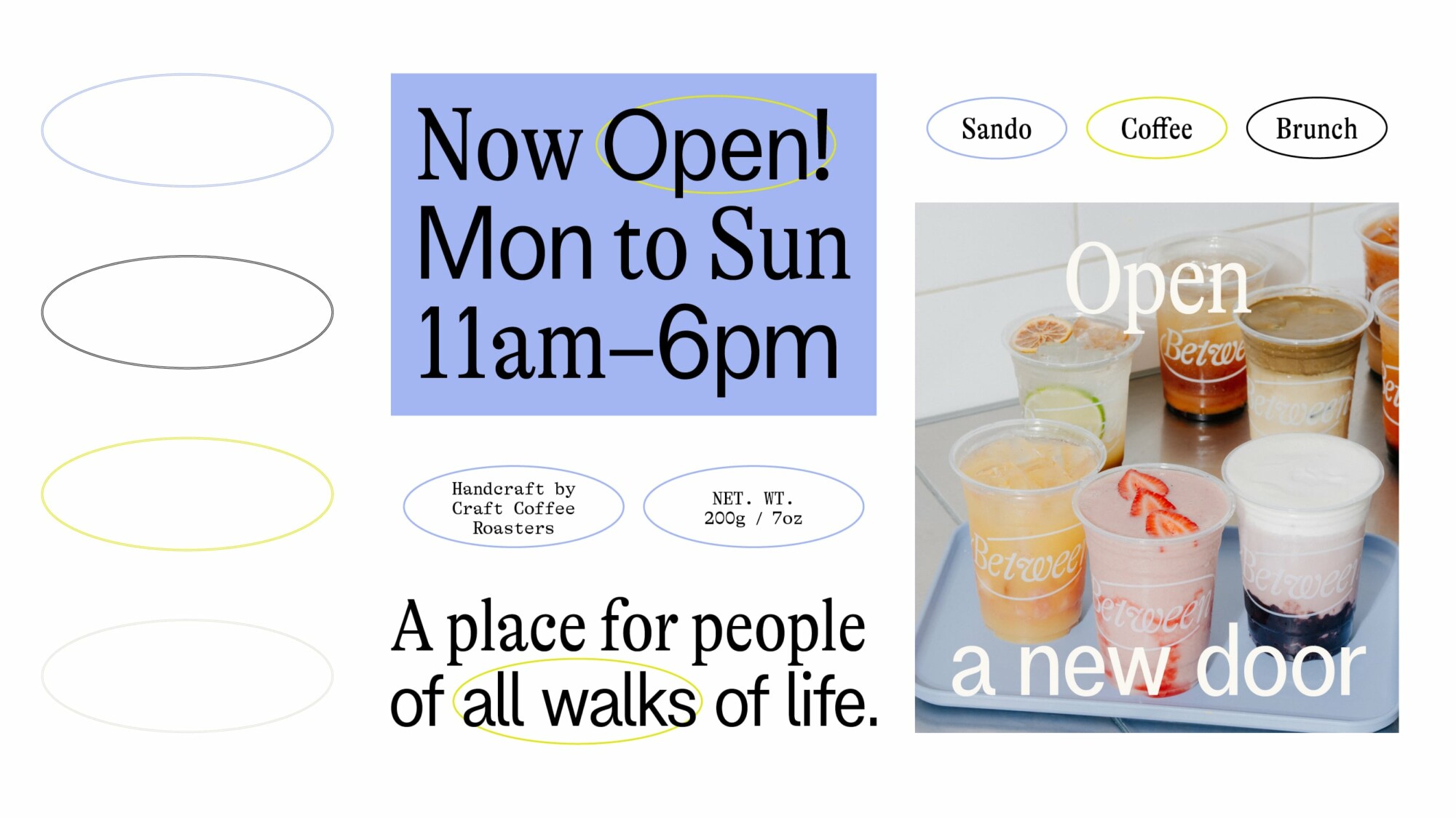
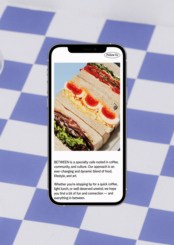
Between is a specialty cafe concept rooted in coffee, community, and culture. A destination that blends the progressive world of food, art, and unique experiences.
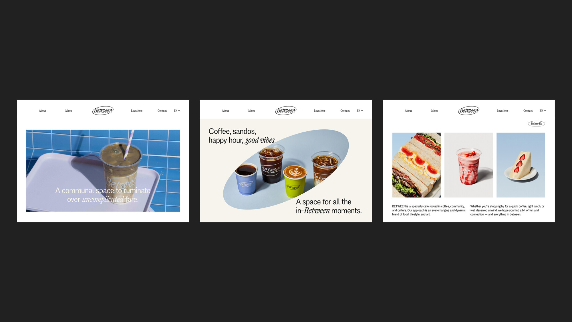
The goal of the rebrand was to create a visual identity that stands out within the landscape of Hong Kong cafes. The work included defining typography, colour palette, imagery direction and web design. The new identity was launched in tandem with the cafe’s newest location in Harbour City, Tsim Sha Tsui.
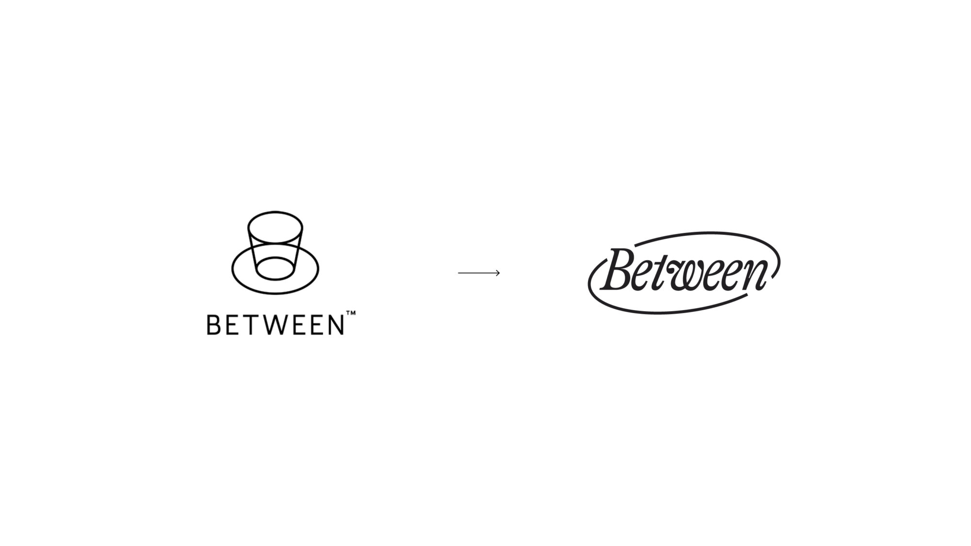
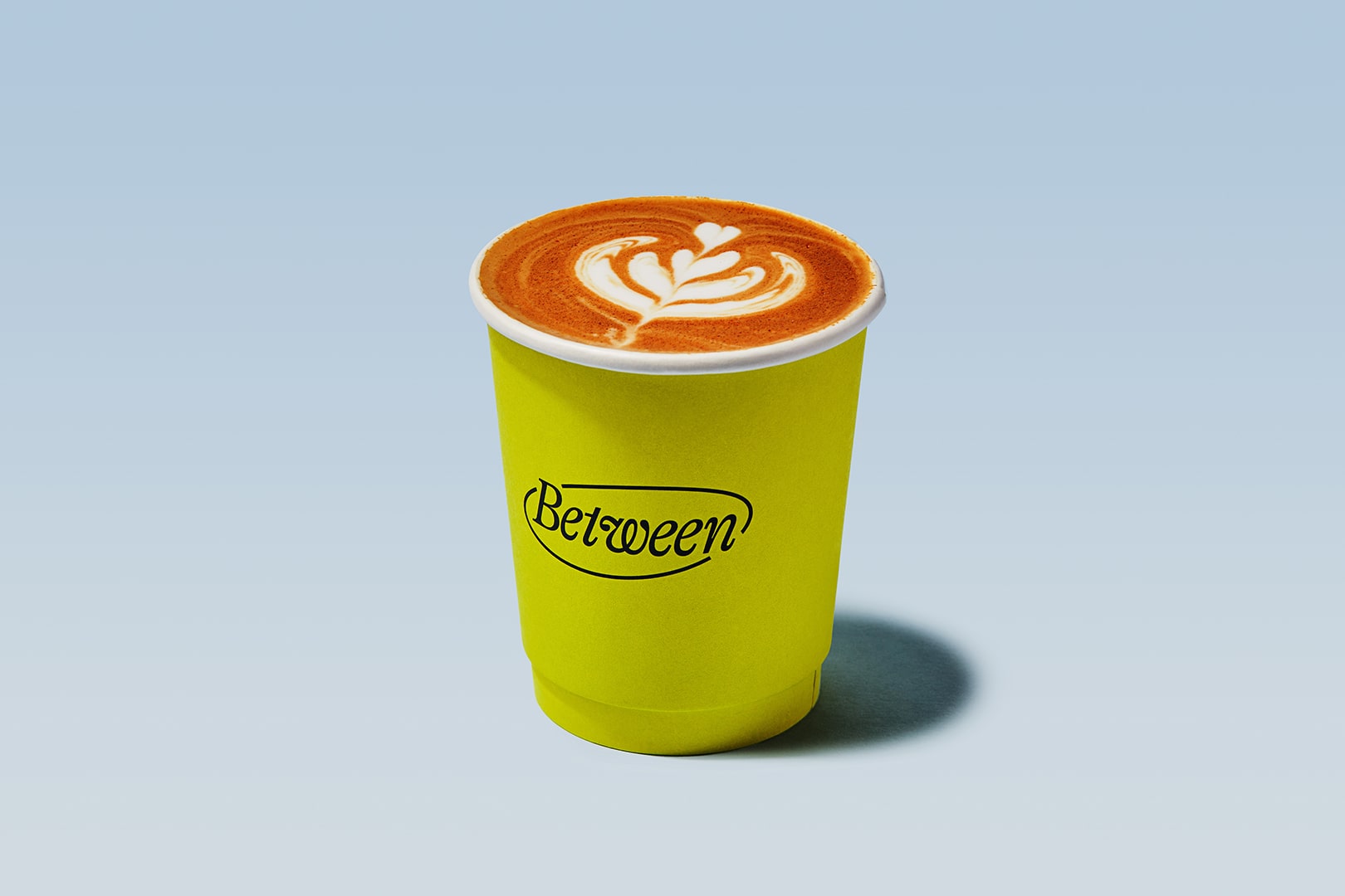
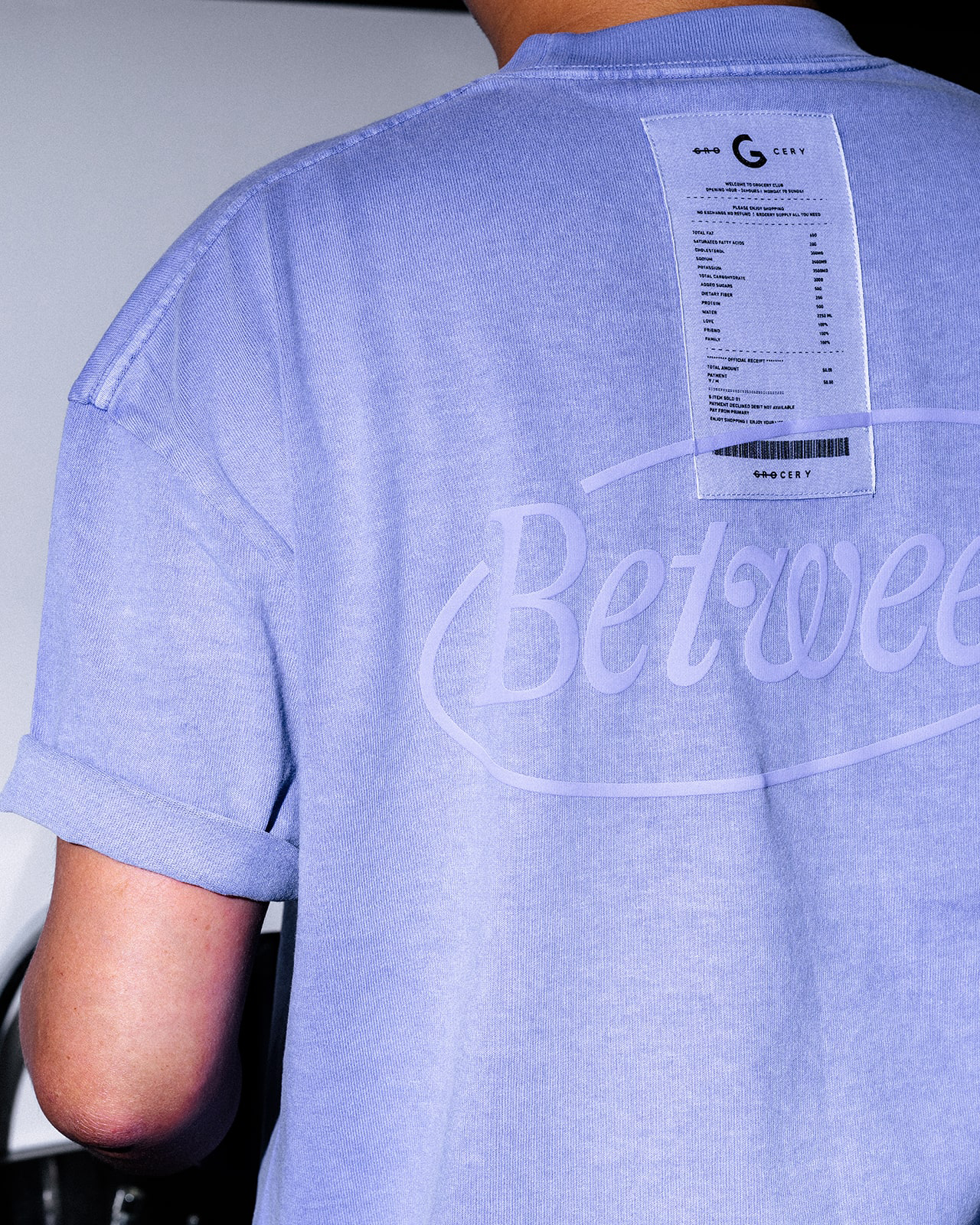
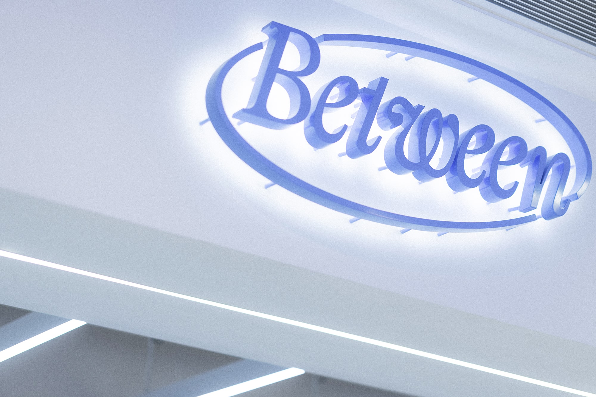
Resembling a coffee bean, the logo is informed by the cafe’s core offering while paying homage to the saucer and cup of the old logo.
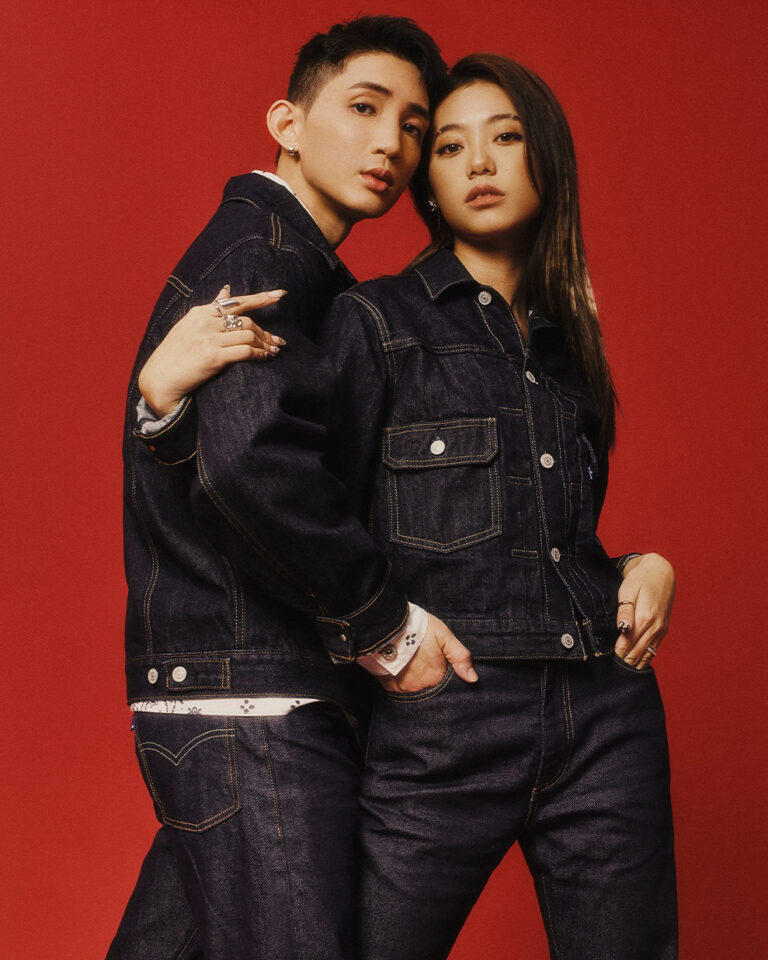
Merchandise by Grocery, a local lifestyle apparel brand.
Grocery also produced Between's staff uniforms.
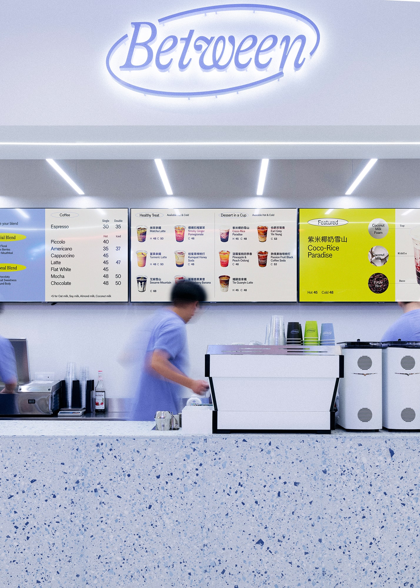
The interior design of the newly opened store is informed by the updated branding.
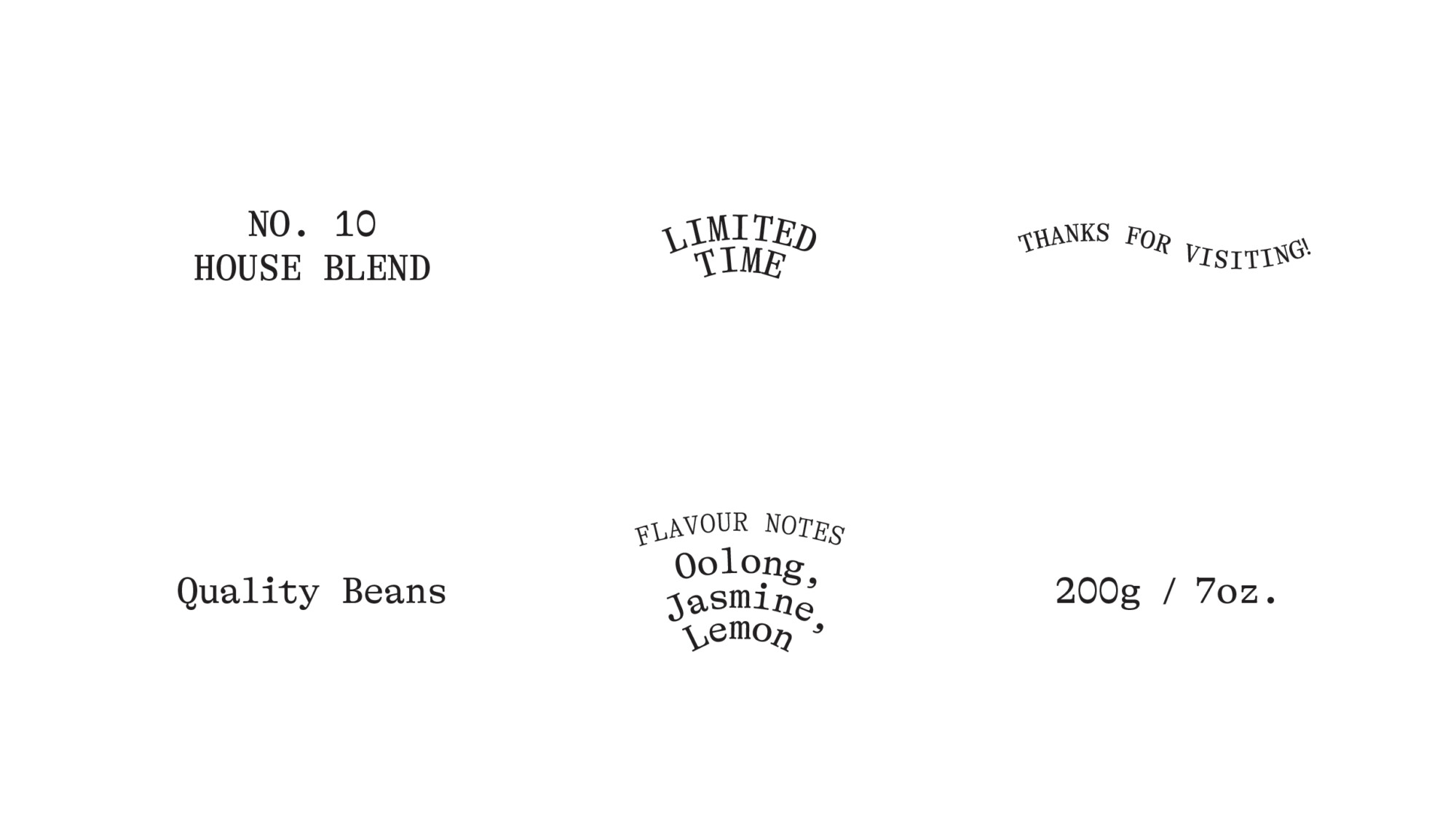
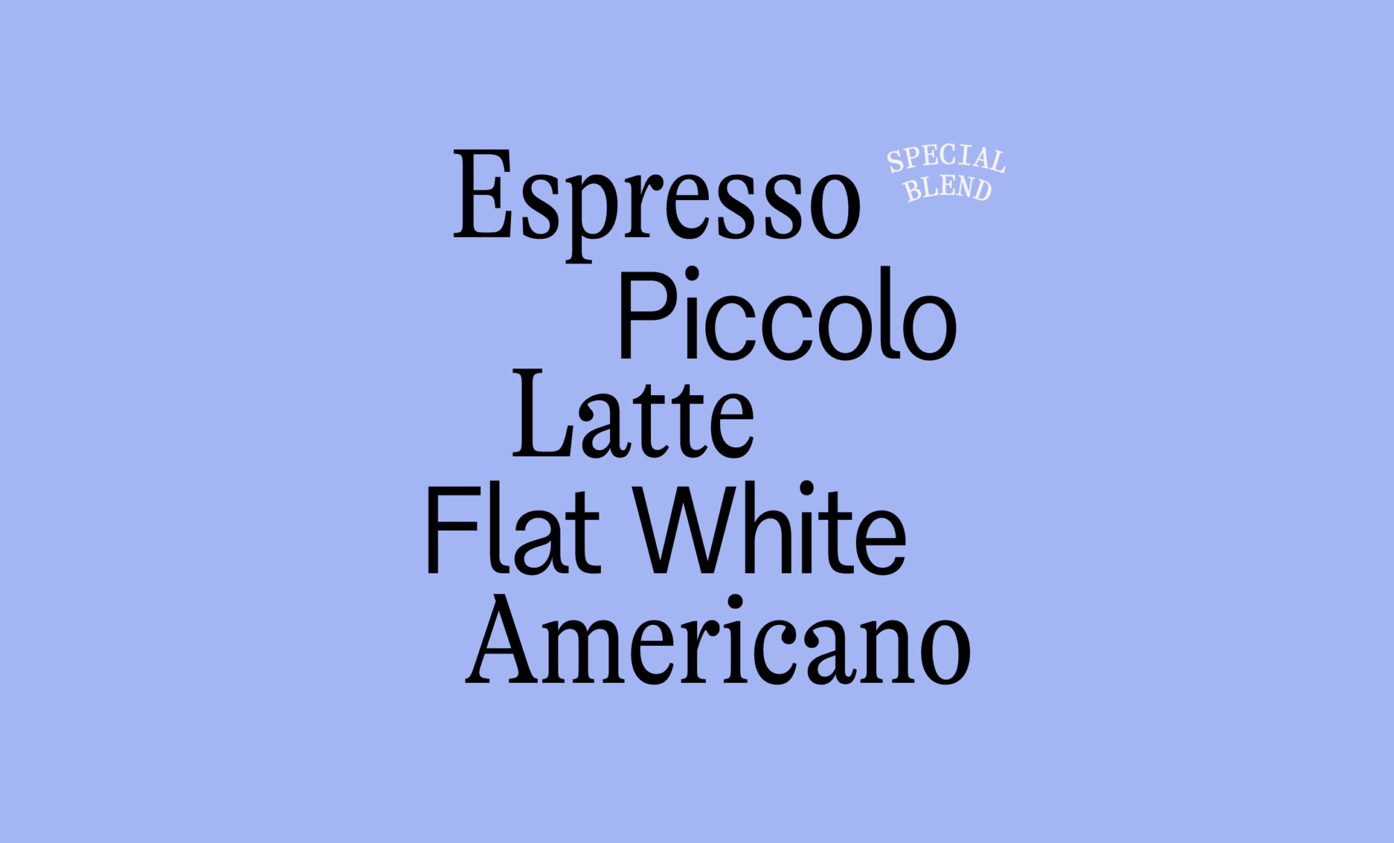
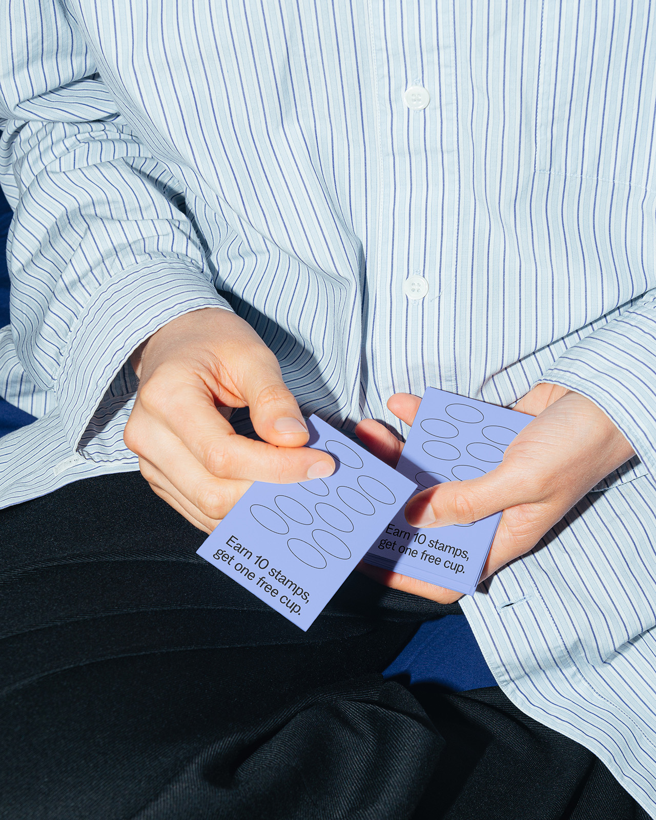
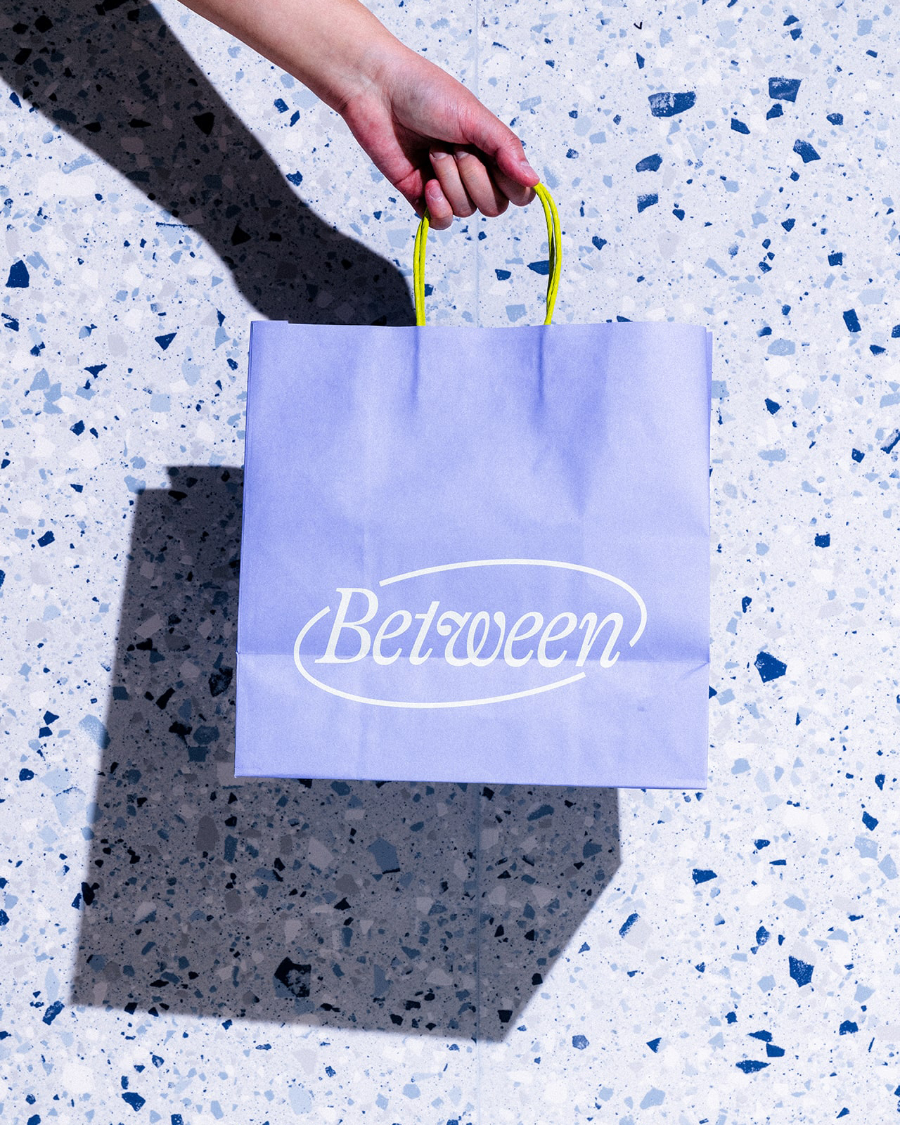
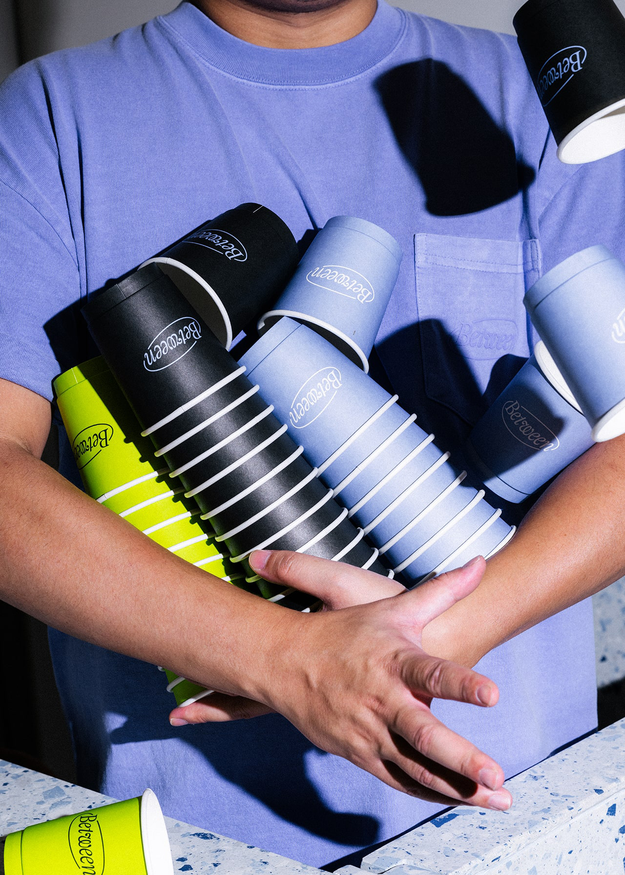
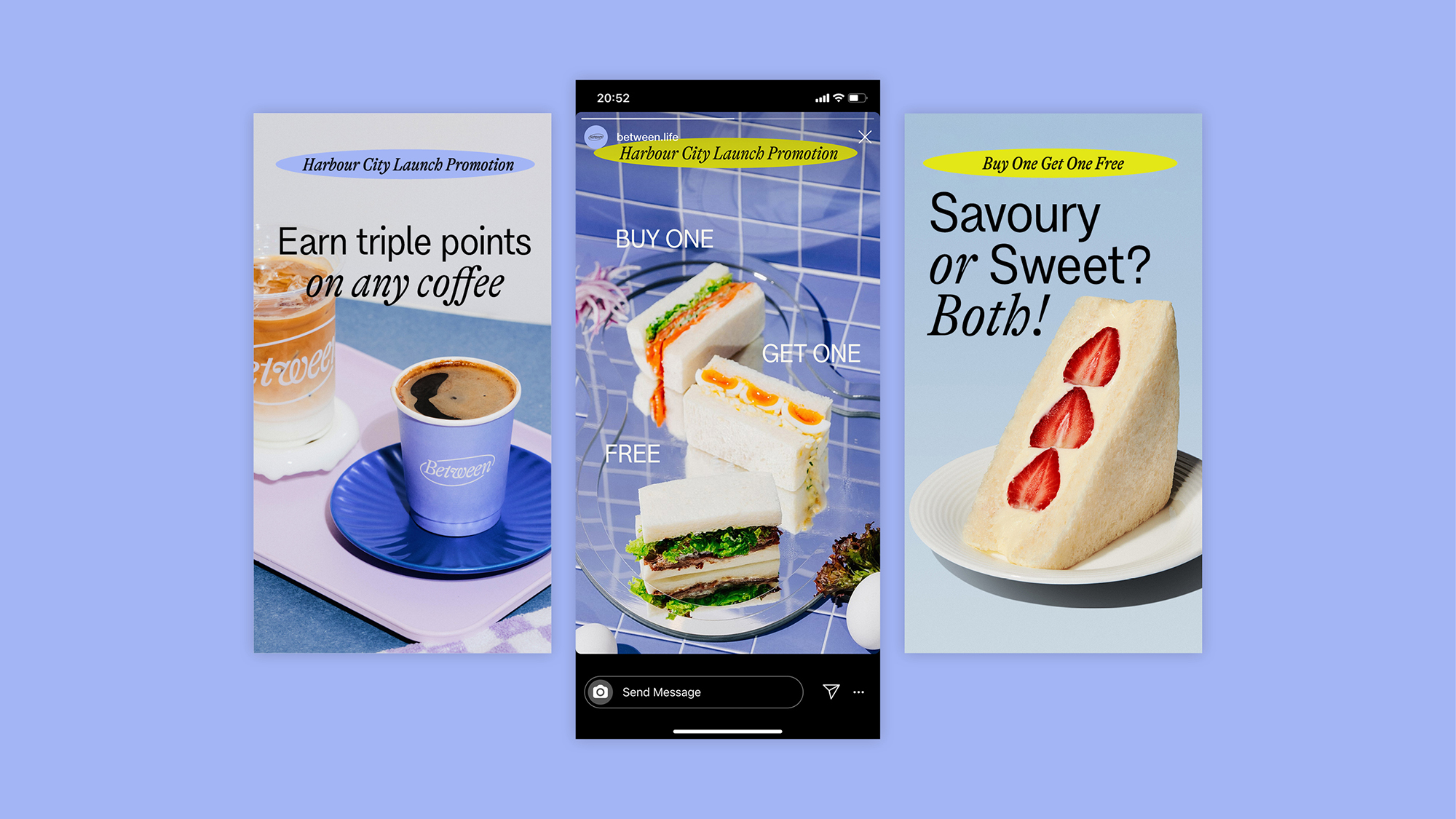
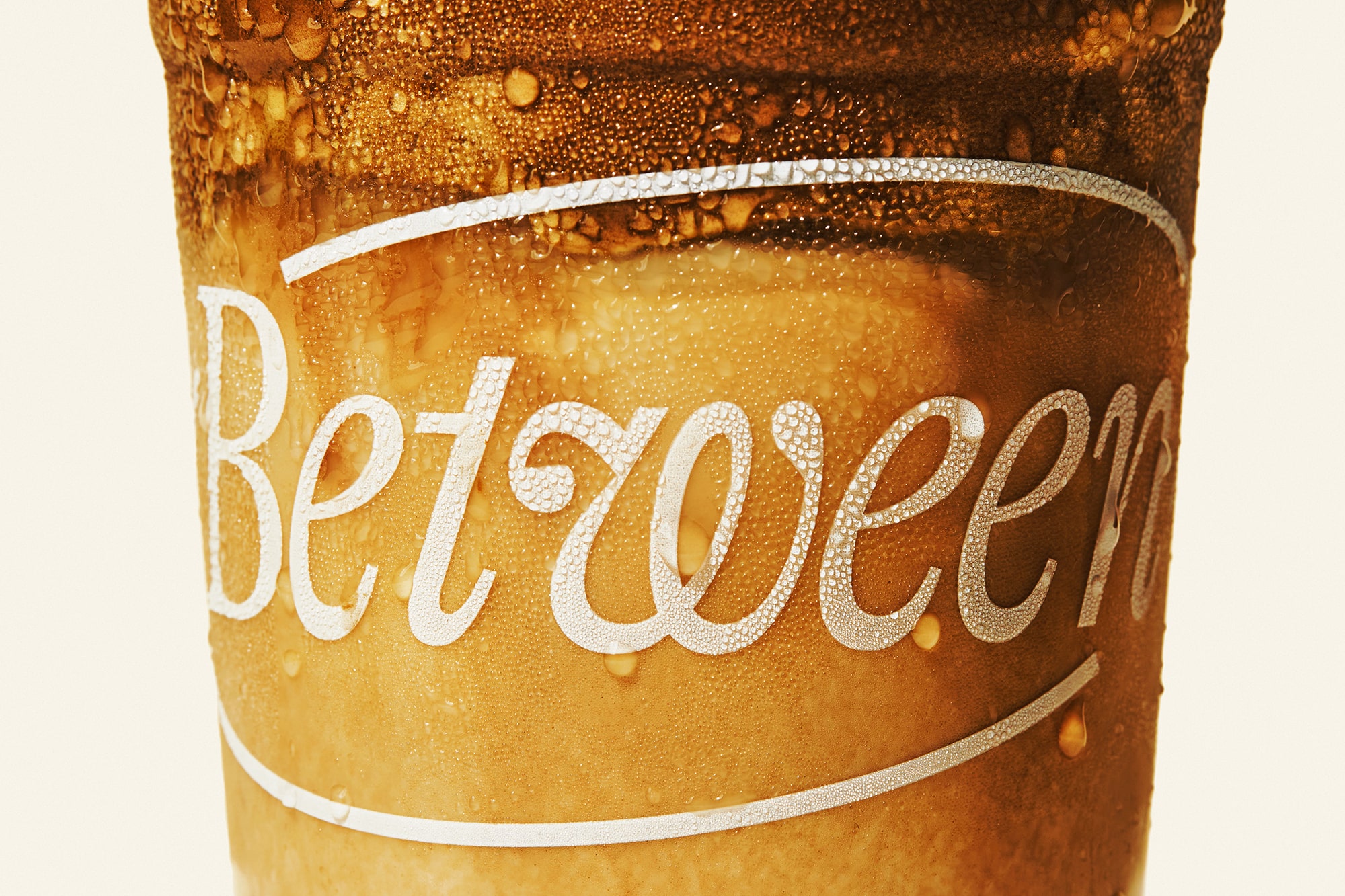
The countertop terrazo pattern is imbued with Between’s signature blue while the digital menus, cups and other packaging are in line with the new typography and colour palette system.
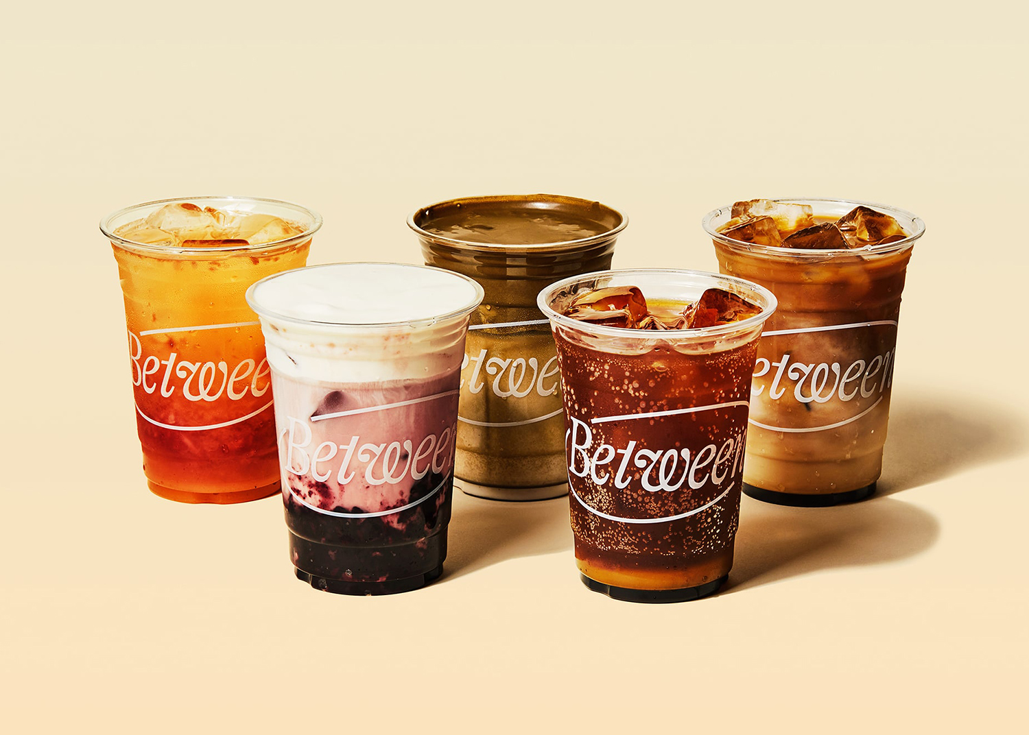
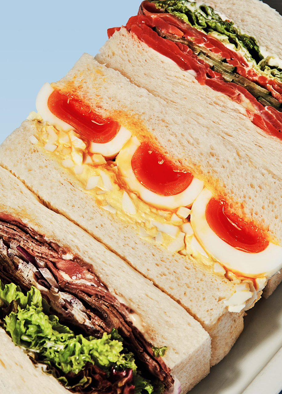
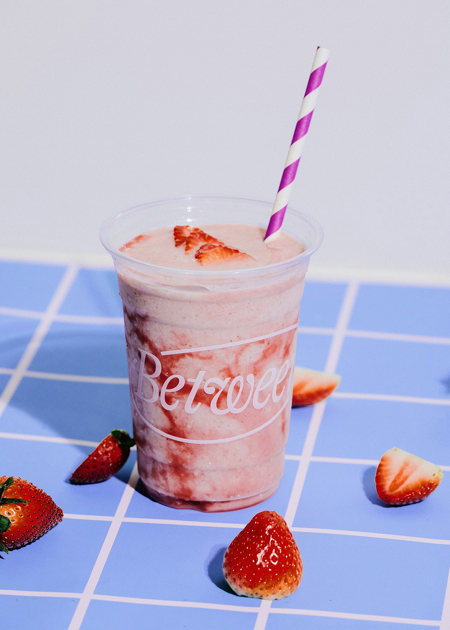
The new photo direction is intended to be bold and colorful but natural and candid. Lifestyle imagery highlights the freshness of the menu as well as the vibrancy provided in Between’s curated spaces.
The high-contrast and vibrant imagery style aims to uniquely position Between in a cafe landscape that is typically hyper-minimal and clean. This approach to photography further helps the brand’s location inside a mall attract visitors by highlighting its unique drinks, food and other non-coffee offerings.